Additional Choice of Objects for Drawing
I think its useful to expand the choice of drawings so that we can do analysis on chart. Especially circle.
I know there is the current “Ellipse” tool. But distorts its shape when adjusting the scale of the chart and makes it hard to read the chart.
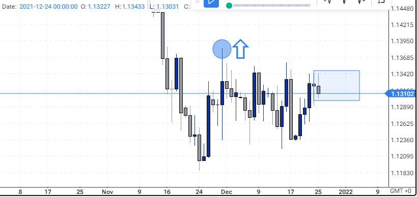
Before
After
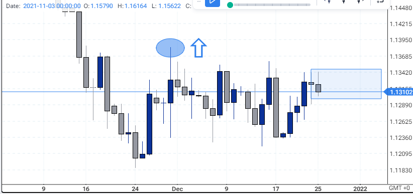
Look at how the arrow maintains its aspect ratio without stretching as compared to the “circle” drawn.
How does this impact your experience?
Share update with 0 linked conversations as well
Upvoters
Status
In Review
Board
💡 Feature Request
Date
Almost 2 years ago
Author

An Anonymous User
Subscribe to post
Get notified by email when there are changes.
Upvoters
Status
In Review
Board
💡 Feature Request
Date
Almost 2 years ago
Author
An Anonymous User
Subscribe to post
Get notified by email when there are changes.